Translating scientific papers for the public
DOI: 10.1063/pt.bzqo.purl

Communicating scientific results to a general audience is difficult. Communicating the tangle of methods and analysis that support neatly packaged results, not to mention the uncertainties, is even more challenging. To lift the hood on the process, I suggest a method to explain science in the most direct way possible: by doodling annotations on scientific papers.

The idea came about two years ago when my mom mentioned that she was excited to read a recent paper of mine. The research was on a subtle systematic effect in cosmological surveys, a topic specific enough that I worried even people in my field would have difficulty understanding it. I wanted to explain the paper in a way that gave my mom a real idea of my work and what went into it.
The result was a doodle summary. I placed the PDF version of my paper in PowerPoint and annotated it with text, diagrams, cartoons, and more. I linked to the annotation on the paper’s arXiv.org page and received a large, positive reception from other scientists. Several researchers have since made similar summaries of their papers.
The annotated-paper approach is helpful for describing research to colleagues, sharing the content of papers with undergraduates, and explaining to the public what goes into scientific research. It’s also a clean way to visually communicate the most important ideas from a paper’s plots and tables. I’ve found that general audiences are often surprised by how much work underlies a single result and how much of a paper scientists may devote to describing all the reasons they may be wrong.
The doodles in this feature annotate the groundbreaking 1998 Astronomical Journal paper by Adam Riess and colleagues, who used observations of supernovae to make a compelling case that the expansion of the universe is accelerating. Combined with research by Saul Perlmutter and collaborators that was published in the Astrophysical Journal several months later, it is the most consequential result in modern cosmology, one that was recognized with the 2011 Nobel Prize in Physics.
The snippets illustrate some of what I did to summarize the paper by Riess and colleagues. I encourage readers to try to do something similar with their own research papers.

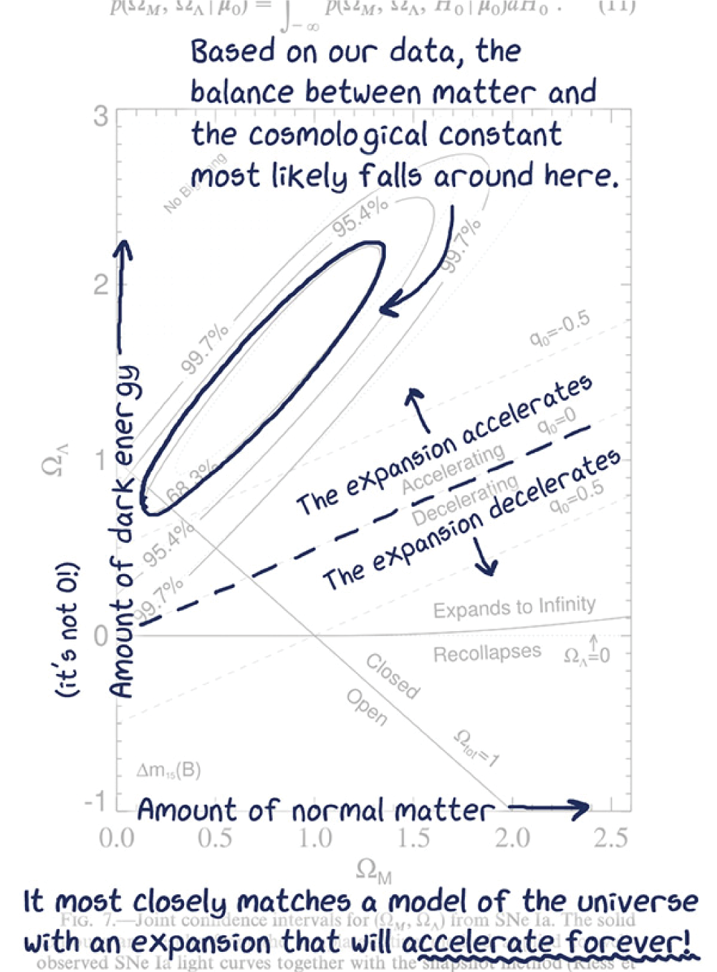
Appearing halfway through the 30-page manuscript, this is the pivotal graph that demonstrates the universe’s accelerating expansion. A doodle summary highlights a plot’s takeaways while de-emphasizing the jargon and symbols. Axis labels are simplified, and helpful context is included.

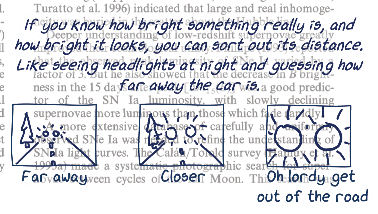
This set of cartoons is a fun way to illustrate a basic principle for using supernovae at various distances to measure the universe’s expansion.

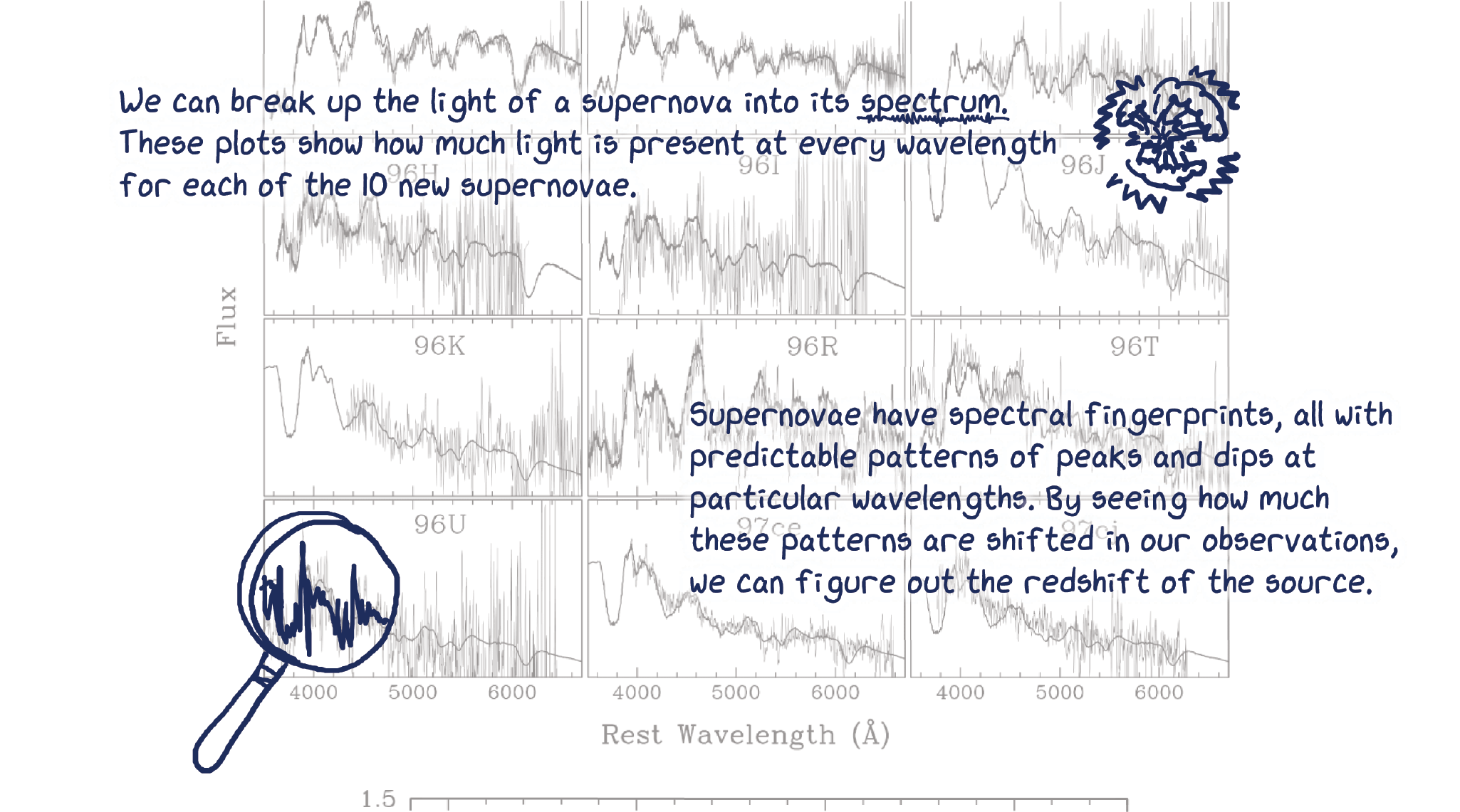
Data tables and figures are ideal places to explain the background science that underlies the research. In this example, annotations overlaying the spectra of several supernovae explain spectroscopy and how it is used to measure the redshift of cosmic objects.

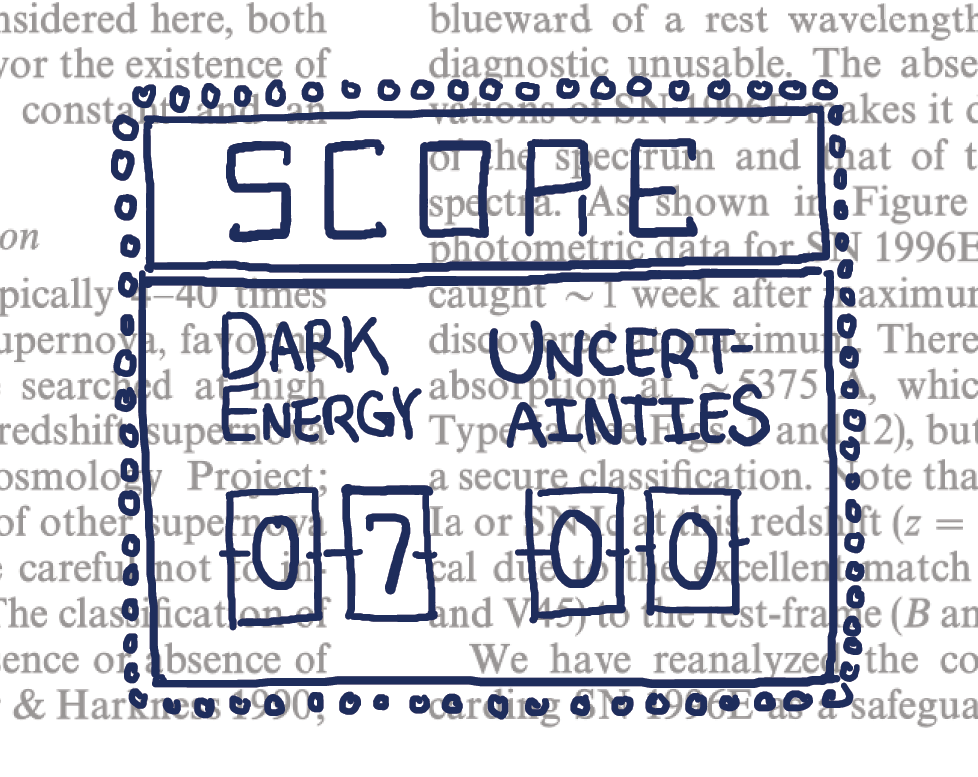
As many researchers do in their papers, Adam Riess and colleagues use a significant portion of their manuscript—in this case, 7 of their 30 pages—to address all the possible ways they may be wrong. A doodle summary simplifies each of those factors without glossing over them, like many popular-science articles do. For researchers summarizing their own work, it’s a valuable opportunity to describe how much effort goes into producing a piece of peer-reviewed research.
The full doodle can be found at physicstoday.org/doodle
The annotations use the xkcd font,
More about the authors
Claire Lamman is a cosmologist, science communicator, and PhD student at the Center for Astrophysics | Harvard & Smithsonian in Cambridge, Massachusetts.


