Behind the Cover: December 2021

Each month, Physics Today editors explore the research and design choices that inspired the latest cover of the magazine.
Two feature articles about soft matter appear in Physics Today‘s last issue of the year. One
Van Ravensteijn and Voets begin their article by discussing the more familiar class of colloids that form in equilibrium. Among the examples they cite are the nanostructures that give butterfly wings their bright color and opals their milky sheen. What about putting a butterfly on the cover? Physics Today‘s editor-in-chief, Charles Day, edited the article. He rejected that idea—not because it wasn’t visually appealing, but because the nanostructure origin of the wings’ iridescence is rather familiar. Covers should be not just eye-catching but also surprising.
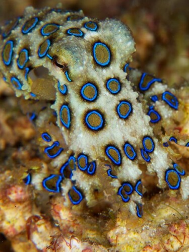
Day looked for other natural examples of nanostructured color and found one in the blue-ringed octopus (Hapalochlaena lunulata). Its distinguishing characteristics owe their vivid hue to the self-assembly of colloidal particles.

iStock.com/MikaelEriksson
Physics Today‘s art director, Donna Padian, picked up the baton and found several images of the octopus. Some, like the one shown to the right, nicely highlight the rings. However, Day reasoned, readers won’t know they are looking at something soft unless they see the whole octopus. The photograph chosen for the final cover (above) was taken by Barbara Moll, whose work appears in Shutterstock under the name kaschibo
The two other principal elements of the cover are the logotype and the main cover line. As usual with magazines, the logotype’s typeface (Orpheus) and its size don’t change from issue to issue. But the color does. Padian chose a gray for its subtle richness.
For the cover line, she sought a serif typeface that would harmonize with the octopus. “When I found Carina with its flourishes and interesting negative shapes (like the center of the o), I knew it was perfect.” The cover line needed to stand out against a dark background, so Padian chose a gold derived from details of the seafloor paired with a contrasting white.
The logotype’s Orpheus typeface was designed in 1928 by Walter Tiemann for the Klingspor Type Foundry in Offenbach am Main, Germany. The Carina typeface is much younger. Moscow-based Alexandra Korolkova


